Mad Logos: Slanted and Enchanted
|
Chris,
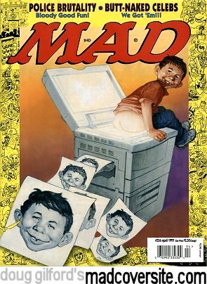
The first appearance of slightly slanted Mad lettering appears to happen with
issue #356, April 1997. It corresponded with the so-called "rebirth"
of Mad. Mad was going through a transition which included becoming a true
monthly, adding some regular features of questionable taste (like Monroe), and
adopting an overall different attitude bent on competing with other more
controversial sources of humor arising from the likes of Howard Stern. Society's taste (or lack there of)
had changed. Mad was due if it wanted to survive.
David Futrelle's April 8, 1997 Salon article supports this view very nicely.
|
Of course this wasn't the first time Mad altered its logo!
As you can see by a few of these examples:
 |
 |
 |
 |
 |
 |
Comic
Daze | Life
Like | People
In The
Letters | Hand
Painted | Classic
Empties | Chalky |
|---|
 |
 |
 |
 |
 |
 |
 |
| Patriotic | Video
Game | Time
Like | Bad | Brain
Pierce | MAAD
Proof | Serpent
Like |
Hey Doug,
A little while ago I noticed something. The logo on issues #24-#26 are different from #27 onwards. The M in MAD has a pointier point.
Declan |
There were five issues where a different idiot redrew the classic satyrs-and-centaurs design presumably by Kurtzman.
Issues 97, 98, 101, 102, and 105 had one-time-only designs by Martin, Jaffee, Prohias, Aragones and Berg.
Sam R |

|